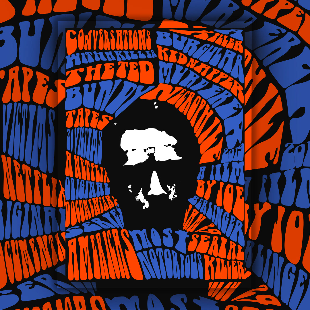
Conversations with Al Killer: The Ted Bunny Tapes Posters by Rund Samman
The posters for "Conversations with Al Killer: The Ted Bundy Tapes," are a mesmerising fusion of 60s psychedelic art and the avant-garde style of renowned graphic designer Wolfgang Weingart. The work is characterised by bold experimentation and a daring approach to composition, evident in the intricate patterns, surreal imagery, and vibrant colours that dominate the posters. Drawing inspiration from the psychedelic movement, the posters evoke a sense of mystique and intrigue, inviting viewers into a visually immersive experience that mirrors the psychological complexity of the series' subject matter. Through his meticulous attention to detail and innovative design choices, Rund pays homage to the artistic legacy of the 60s while offering a fresh interpretation that captivates and intrigues.
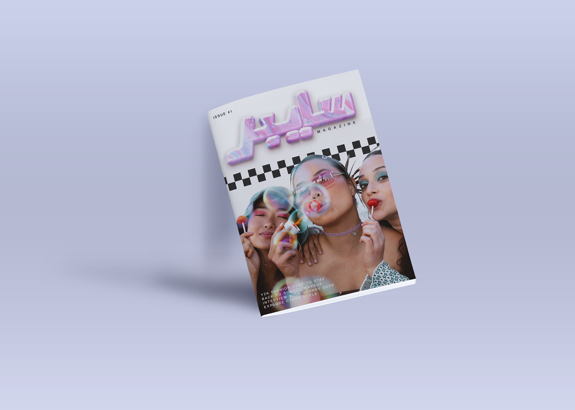
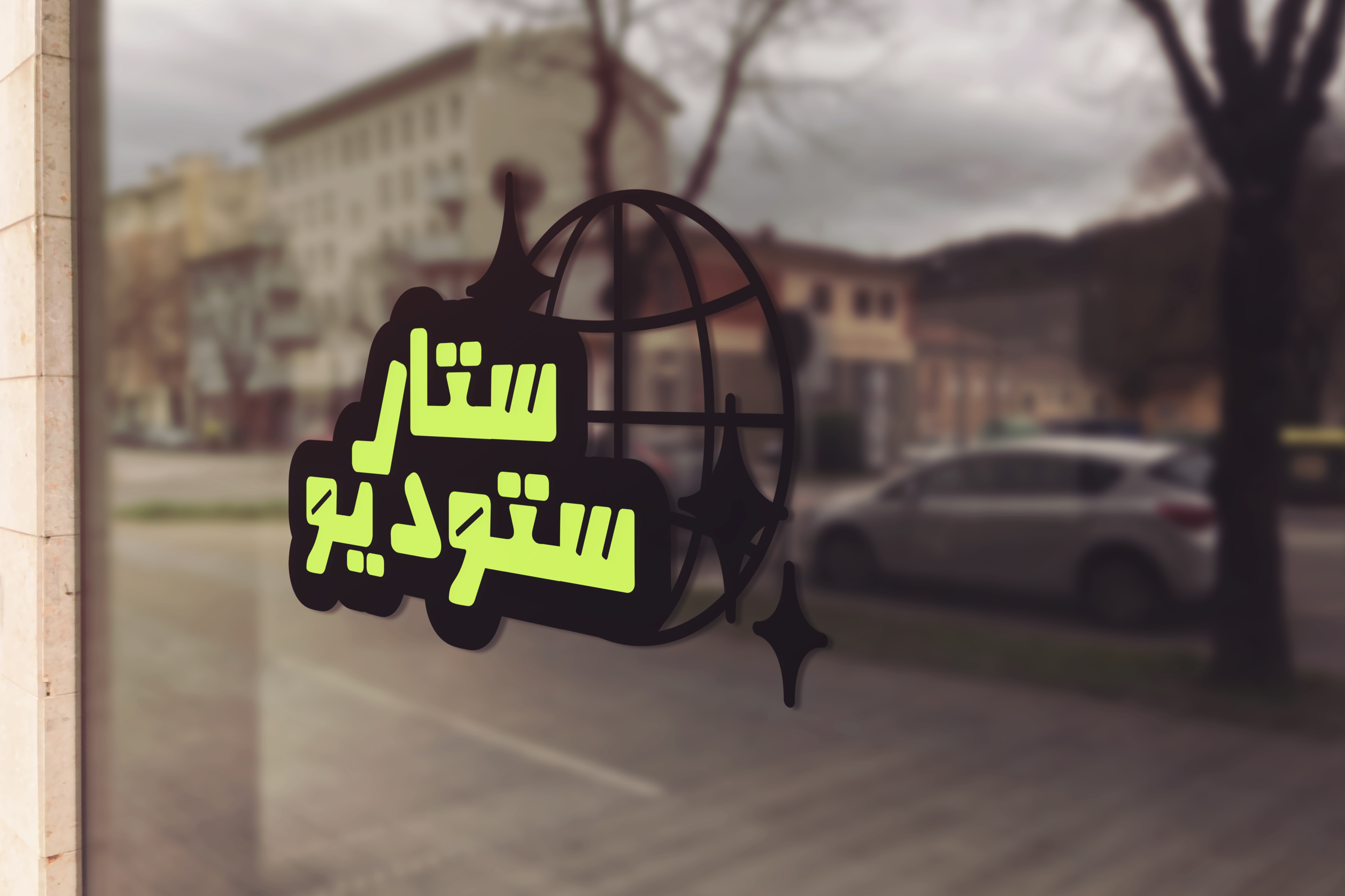
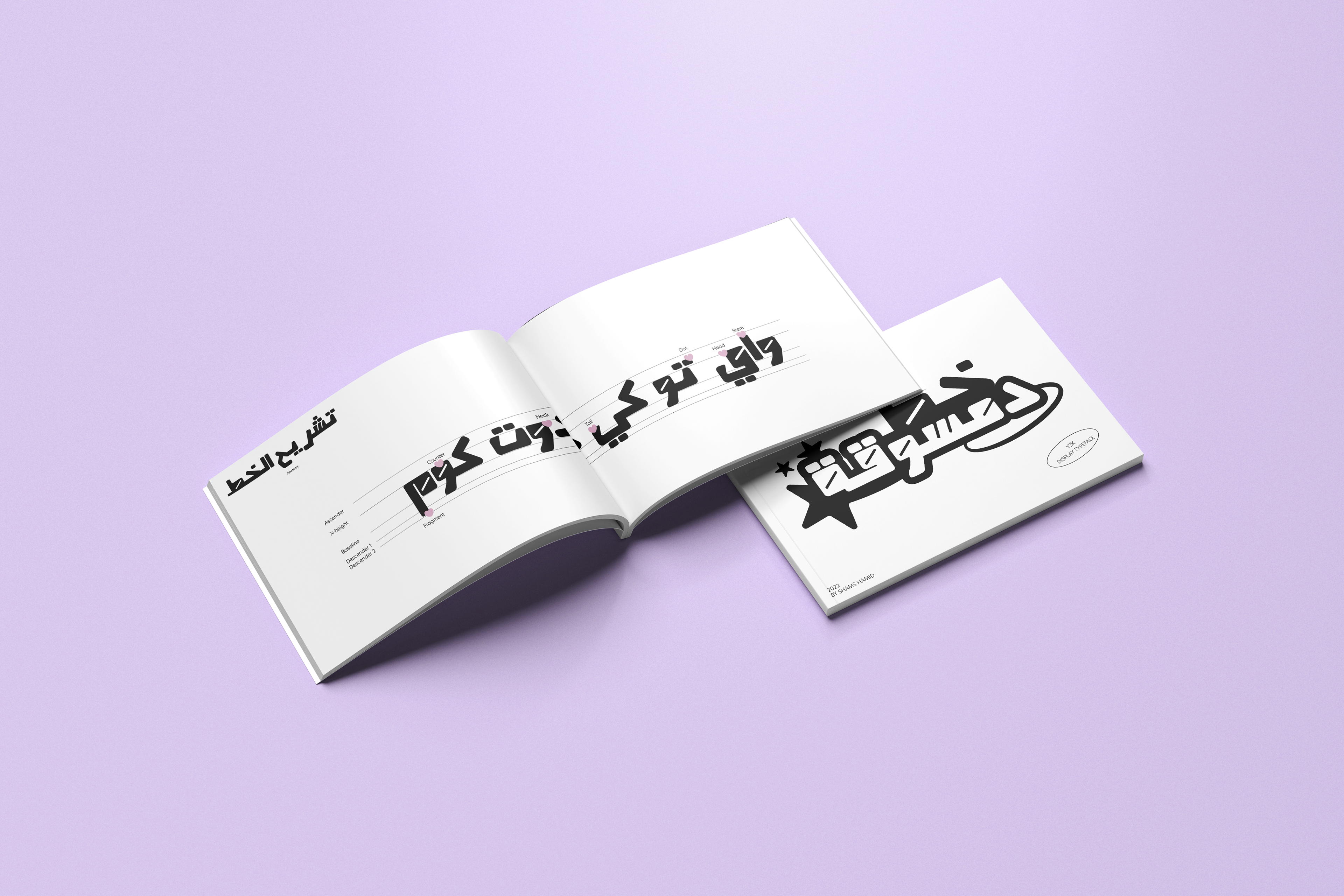

Arabic Typeface Design by Shams Hamid
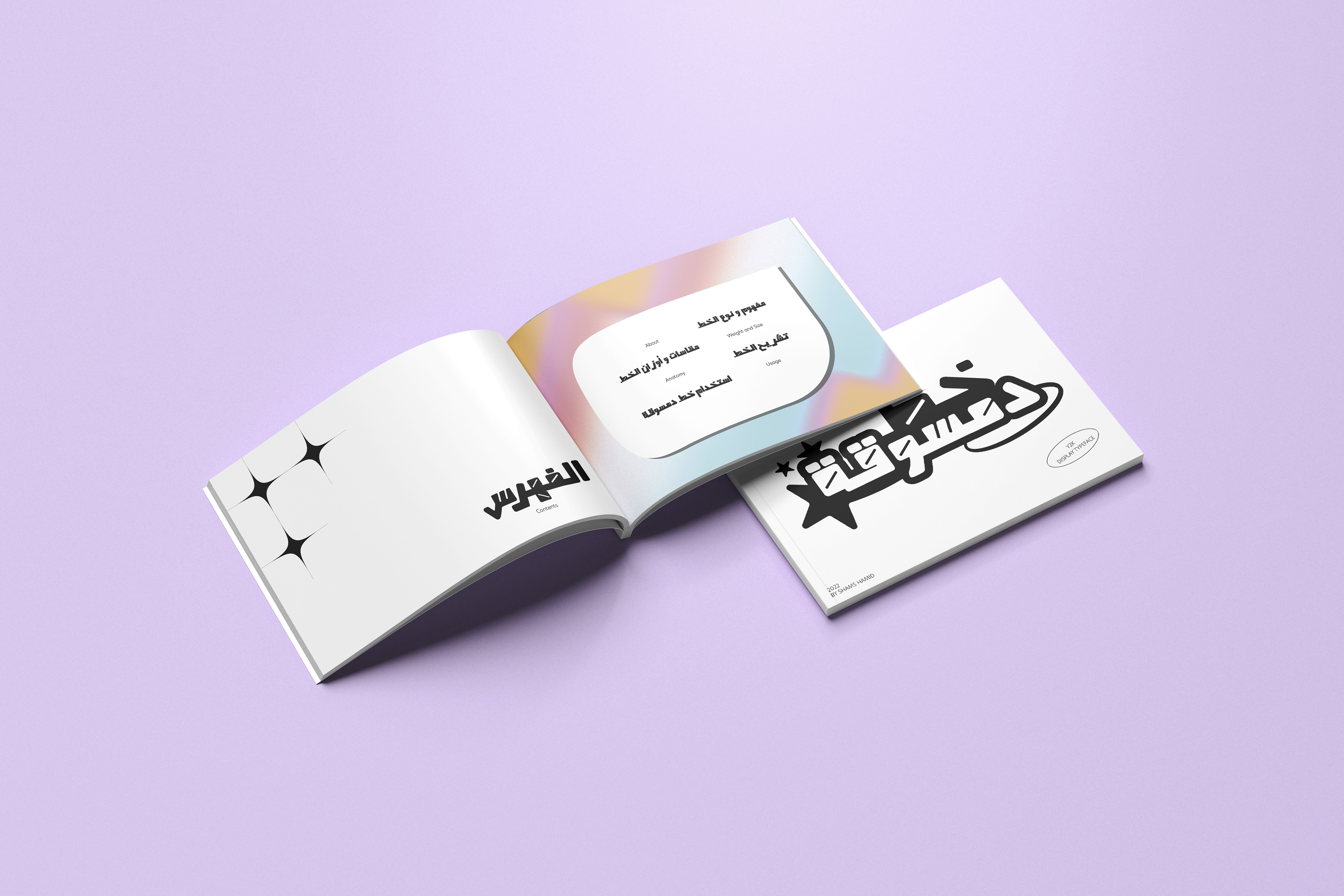
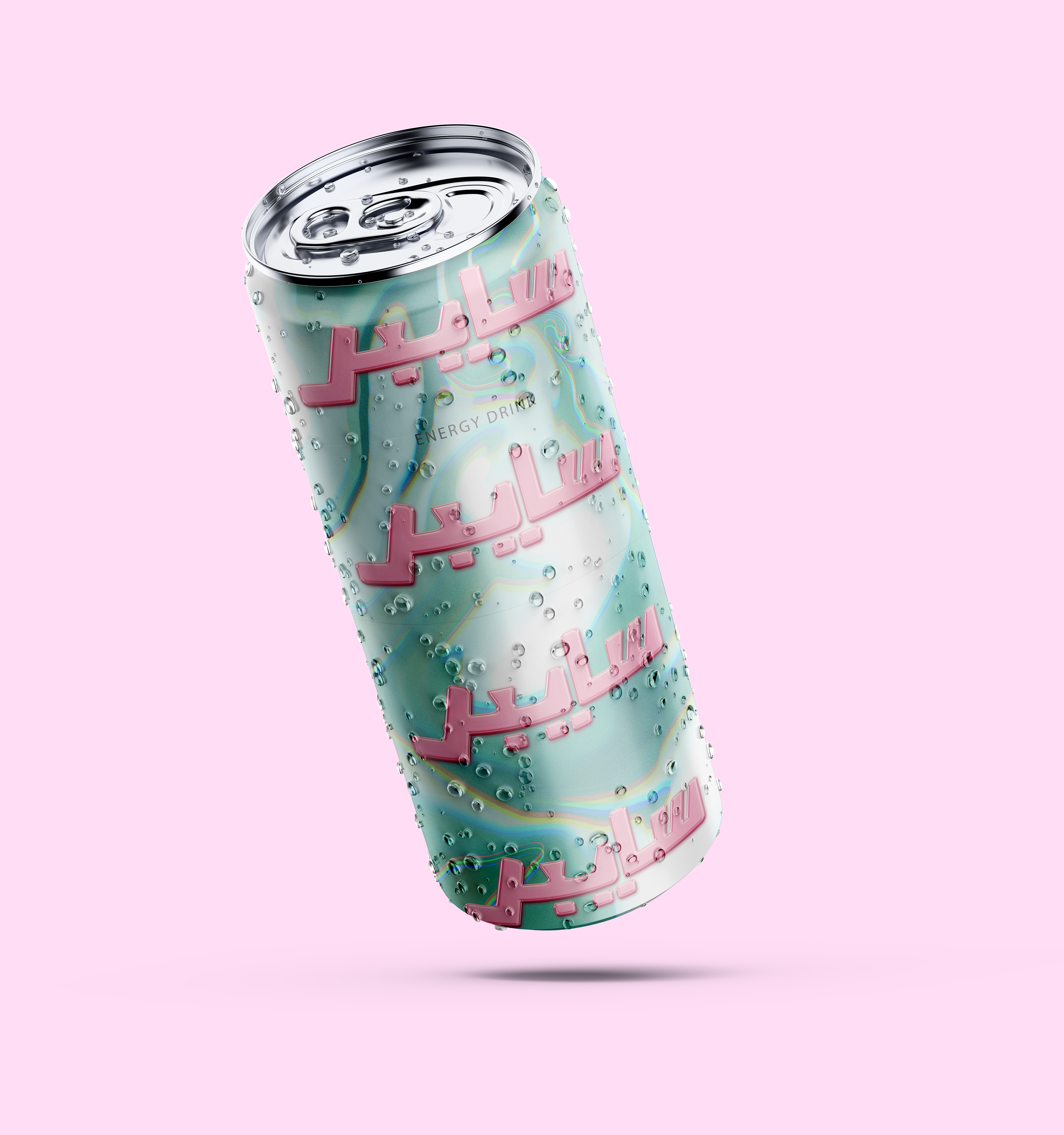
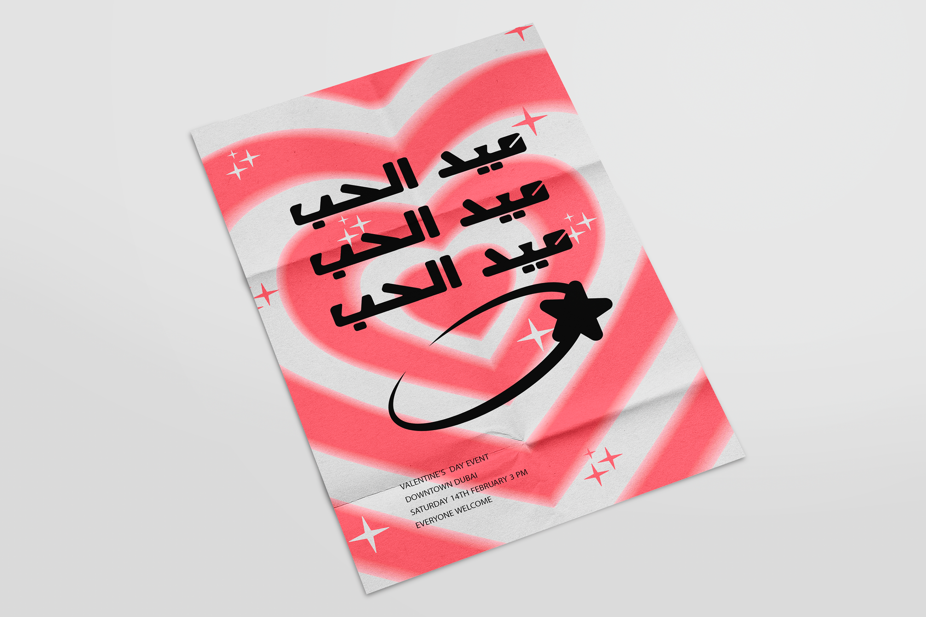
The Y2K aesthetic, also known as Kaybug, emerged as a defining cultural phenomenon from approximately 1995 to 2004, coinciding with the technological optimism leading up to the turn of the millennium. This distinct aesthetic period permeated various aspects of popular culture, including fashion, hardware design, music, and furnishings, with a gleaming aura of tech optimism. The name "ladybug" or Da3sooqa is derived from the Y2K bug, which the movement is named after. The Y2K bug, also called the Year 2000 bug or Millennium Bug, was a coding problem projected to create havoc in computer systems globally at the beginning of 2000. Additionally, the movement was heavily inspired by Japanese anime, kawaii culture, and cute fashion, hence the name "Ladybug." "Bug" refers to the computer bug that originated the movement, while "ladybug" symbolises the cuteness that the movement encompassed. As part of this ongoing exploration, a unique opportunity arises: the creation of an original Y2K-inspired Arabic typeface. With rounded or squared typefaces characterized by quirky counters or round corners, this project aims to capture the essence of the Y2K era's easygoing, fun, and cute aesthetic, infusing it into the Arabic script to offer a fresh and playful interpretation.

Elisabeta Latin Typeface Design by Shams Hamid
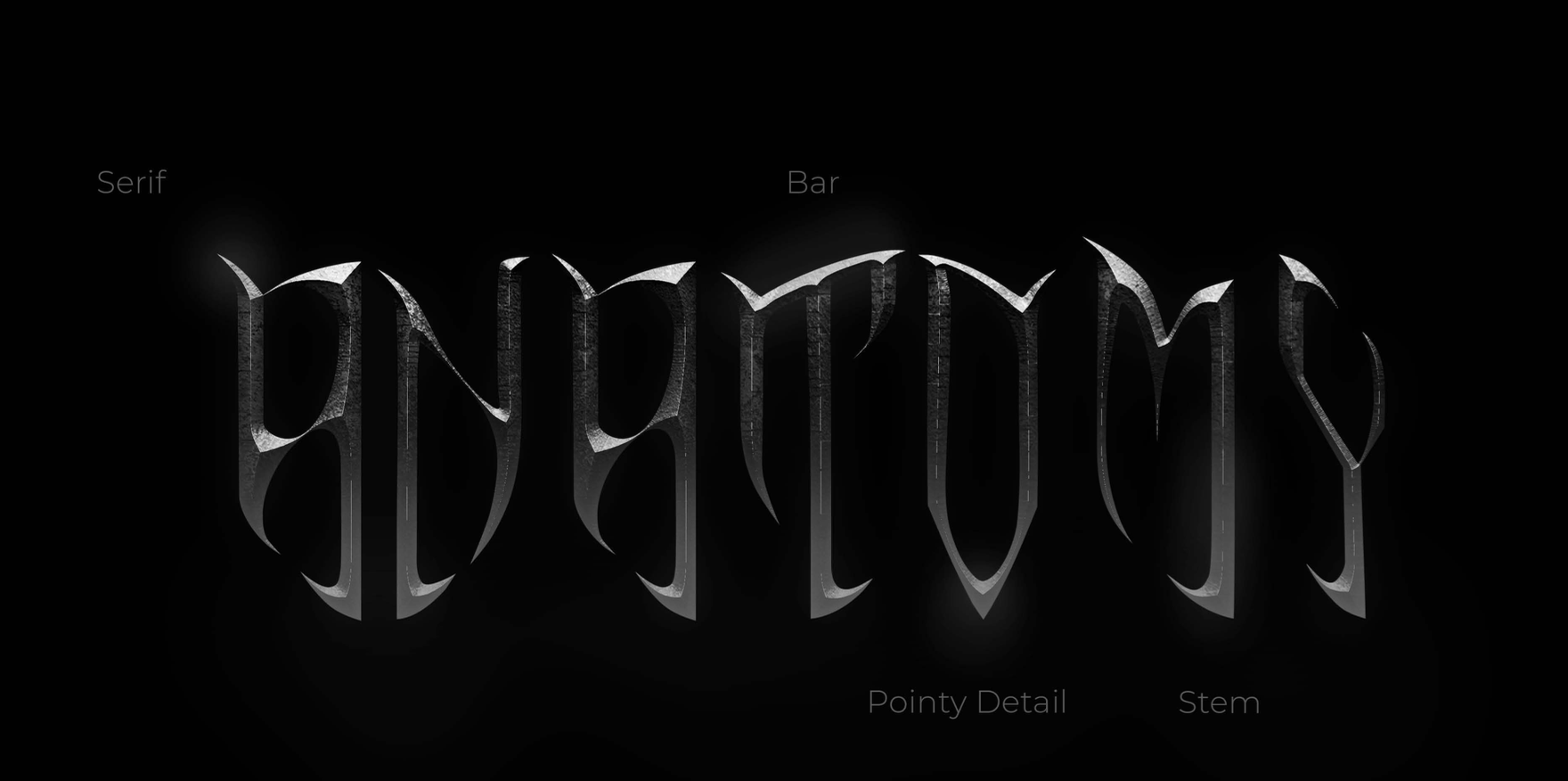
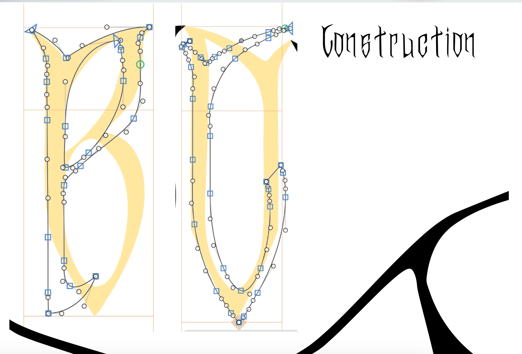
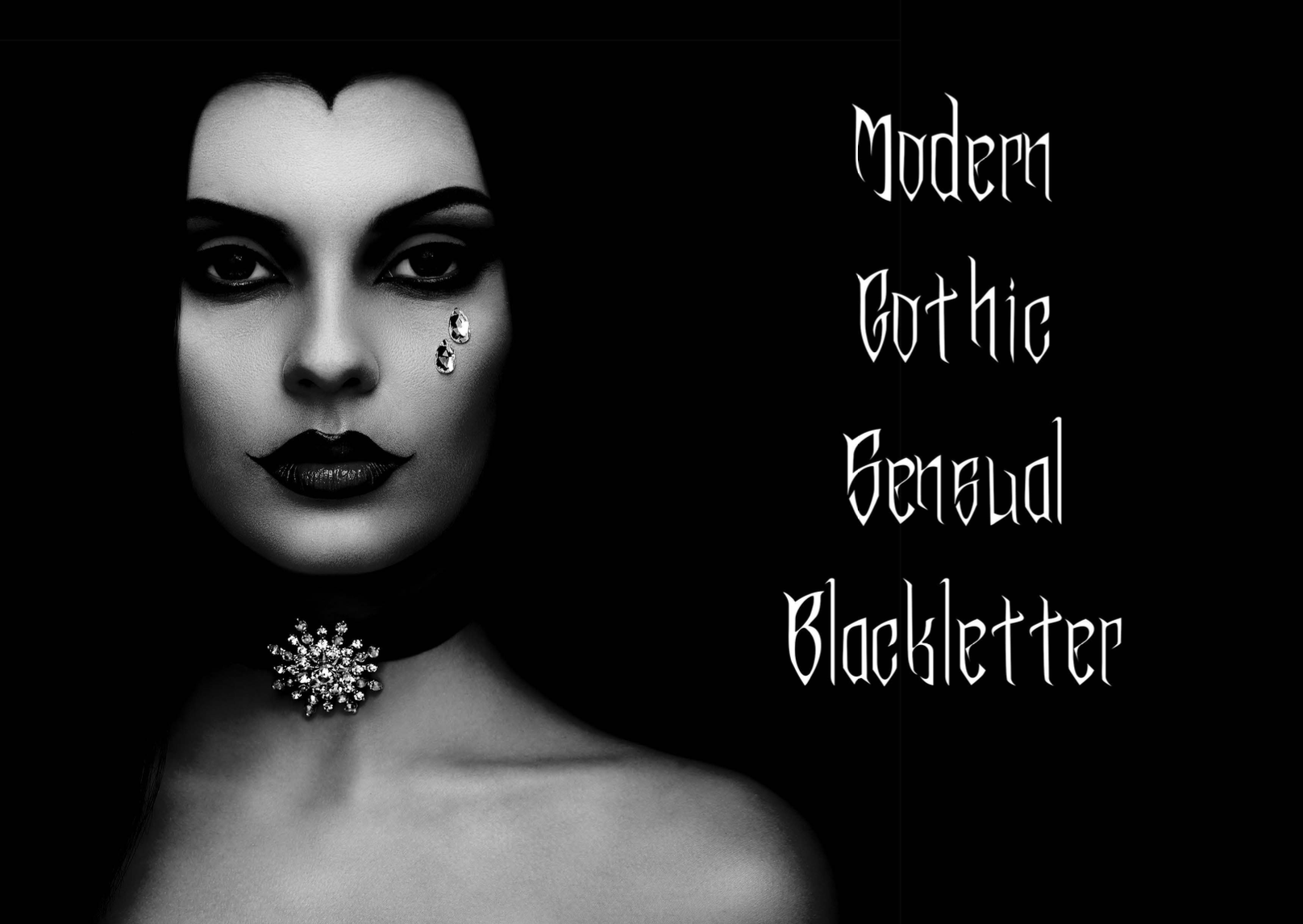
The typeface designed draws inspiration from Blackletter, diverging from clichéd horror fonts. Named Elisabeta after Dracula's wife, it pays homage to strong women in horror, featuring softer, circular strokes. Reflecting a shift in gender roles within the genre, where women are increasingly portrayed as monsters and heroes rather than damsels in distress, this typeface embodies their strength and complexity.
Expressionism Inspired Typographic Book by Neira Osama
This video embodies an experimental typographic theme rooted in expressionism, manifesting a visual representation reminiscent of cinematic scenes, paintings, and emotional artistry. Through the deliberate distortion of reality, it channels the expressive essence of the artist's innermost feelings and ideas. Each typographic element becomes a brushstroke, weaving together a narrative that transcends traditional boundaries. As the imagery fluctuates and morphs, it captures the raw intensity and dynamism of expressionist art, inviting viewers on a journey through the depths of human emotion and perception.
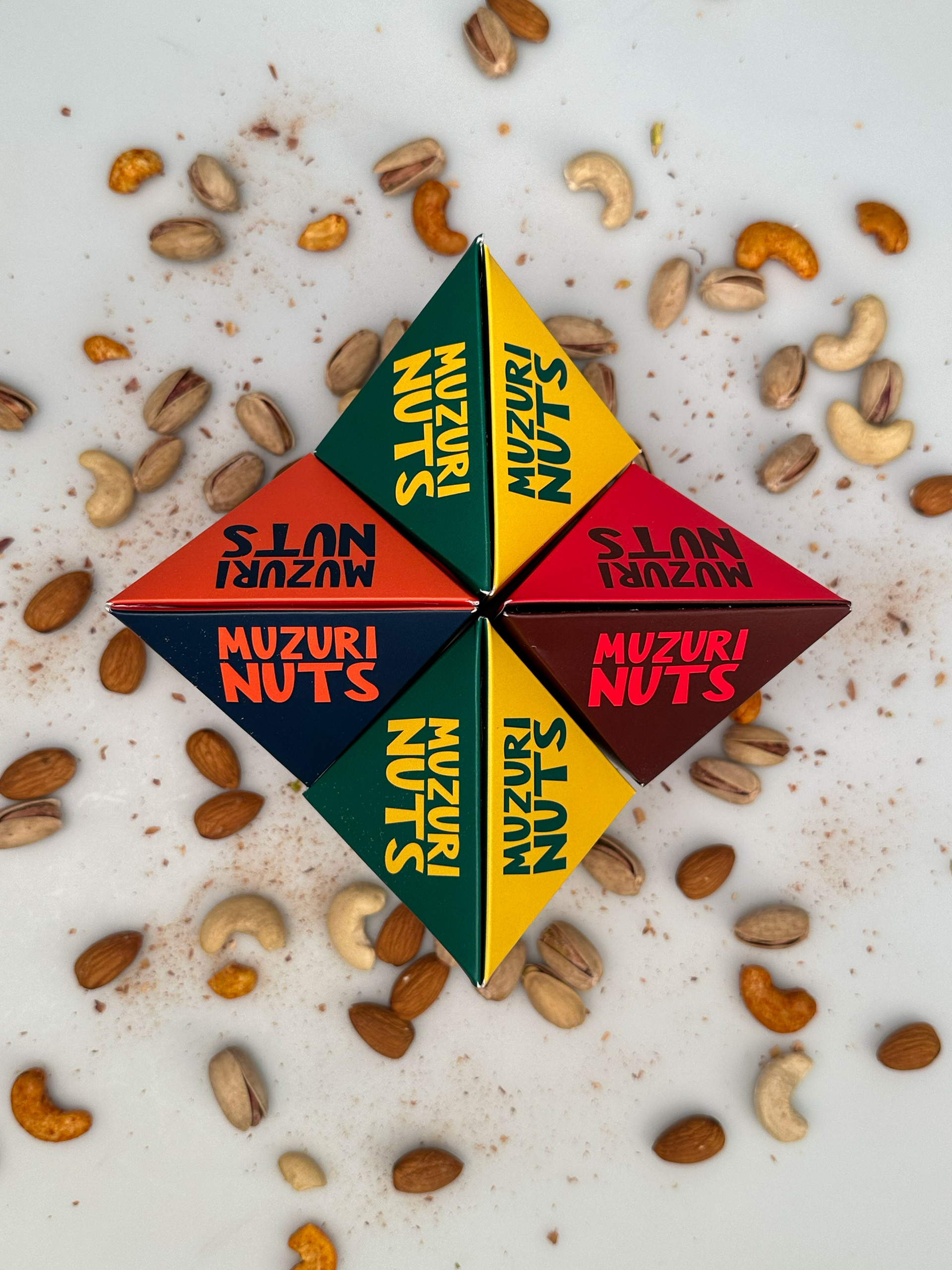
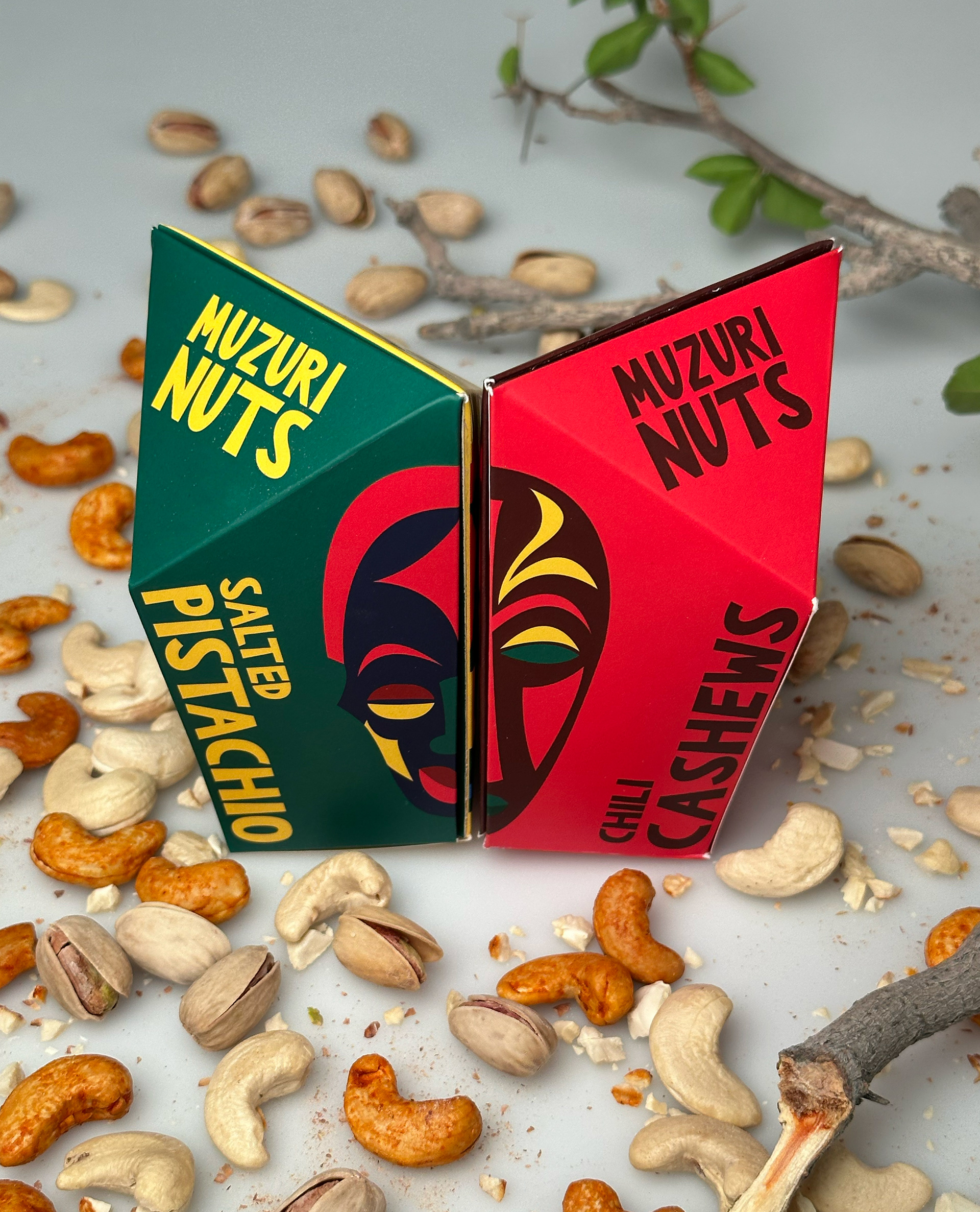
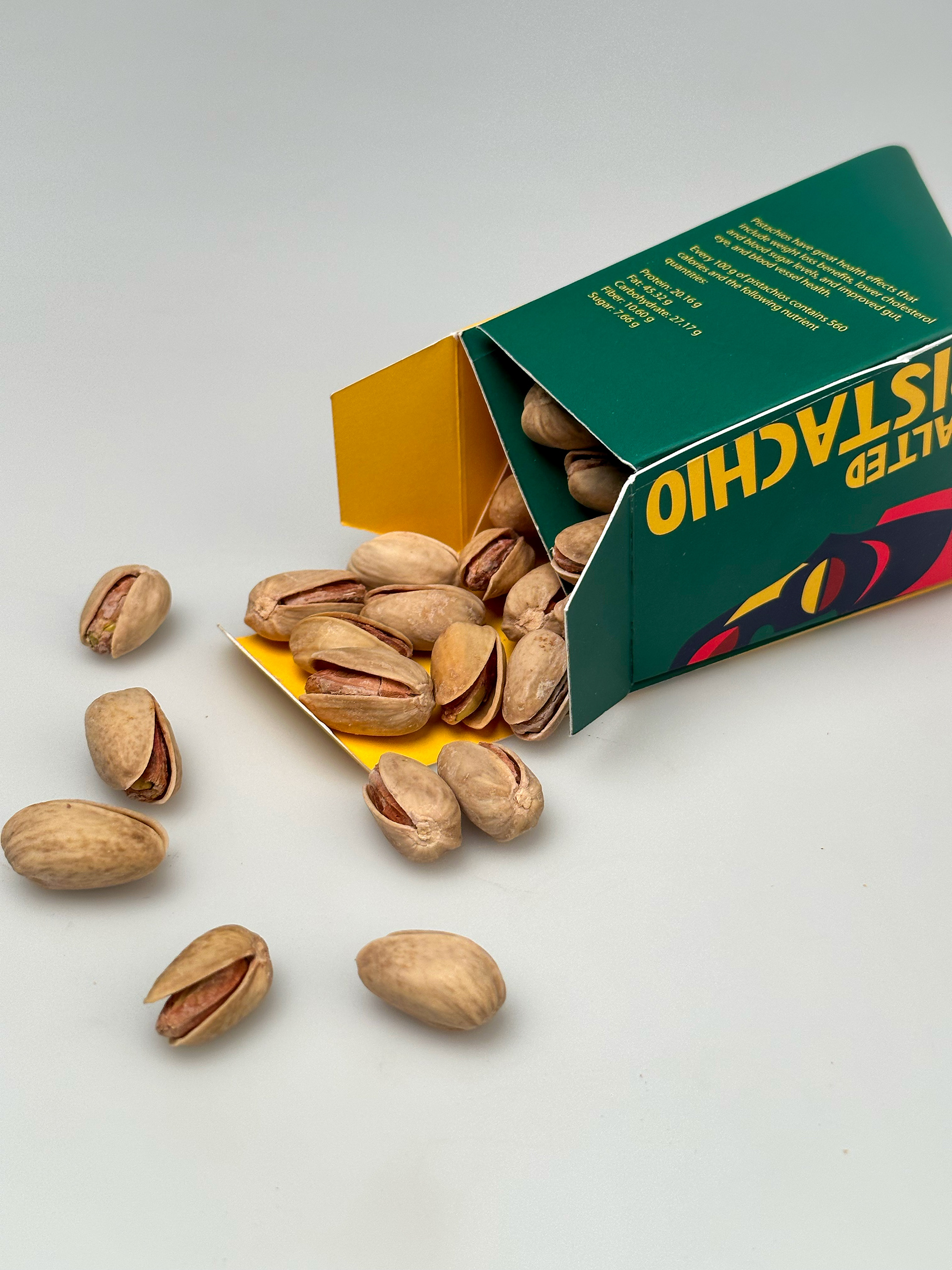
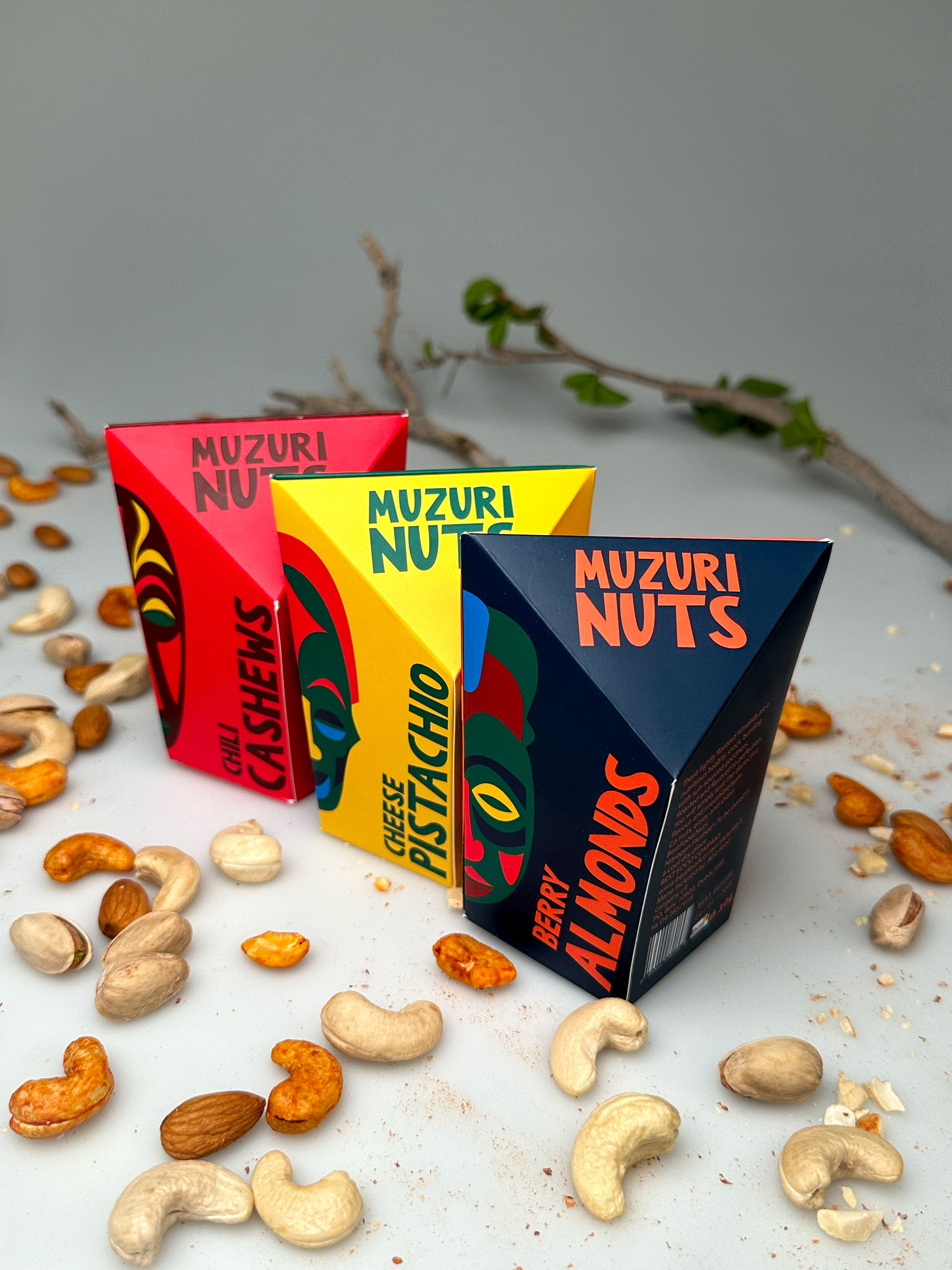
Muzuri Nuts Packaging by Malak ElGendy
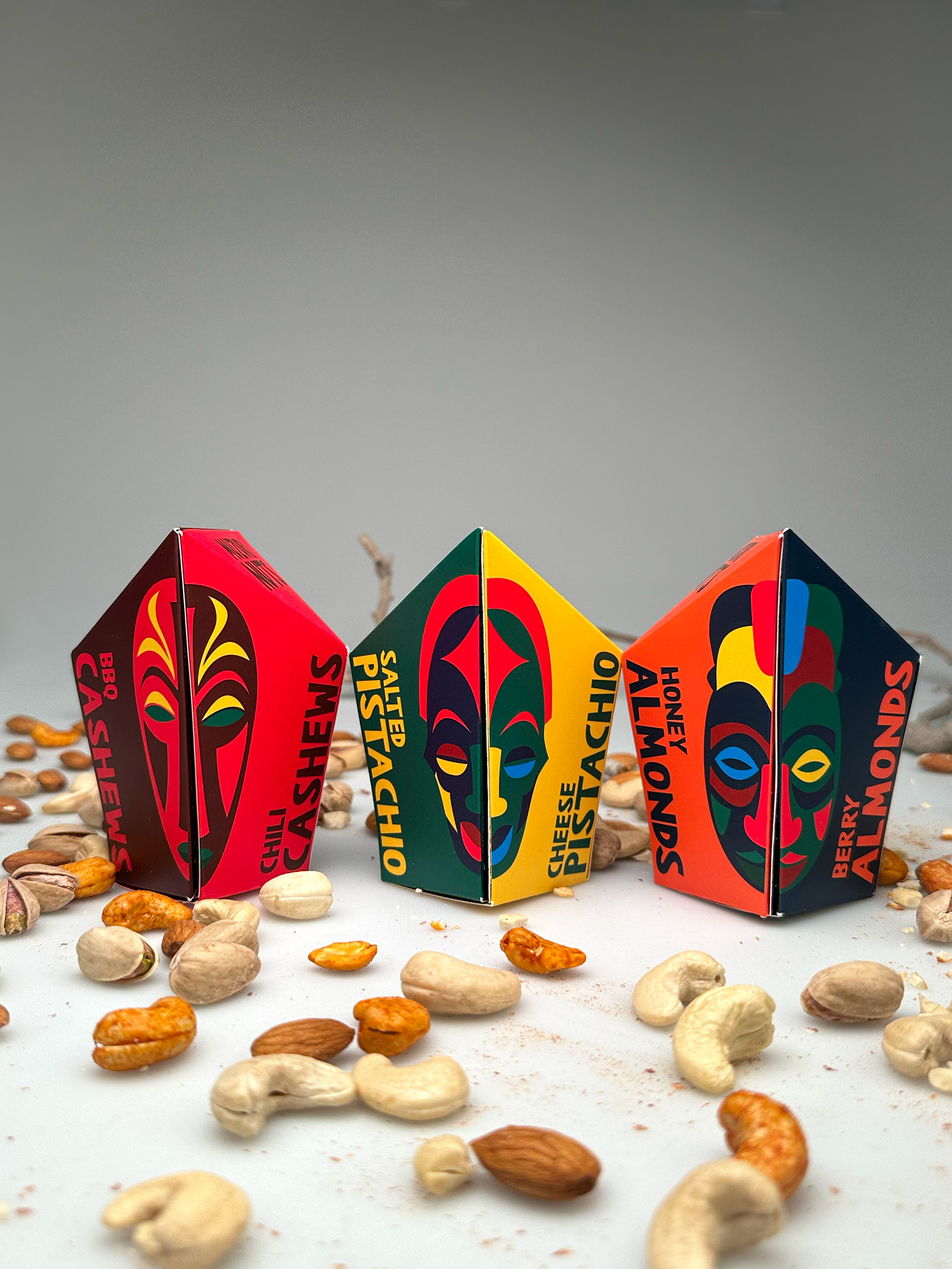
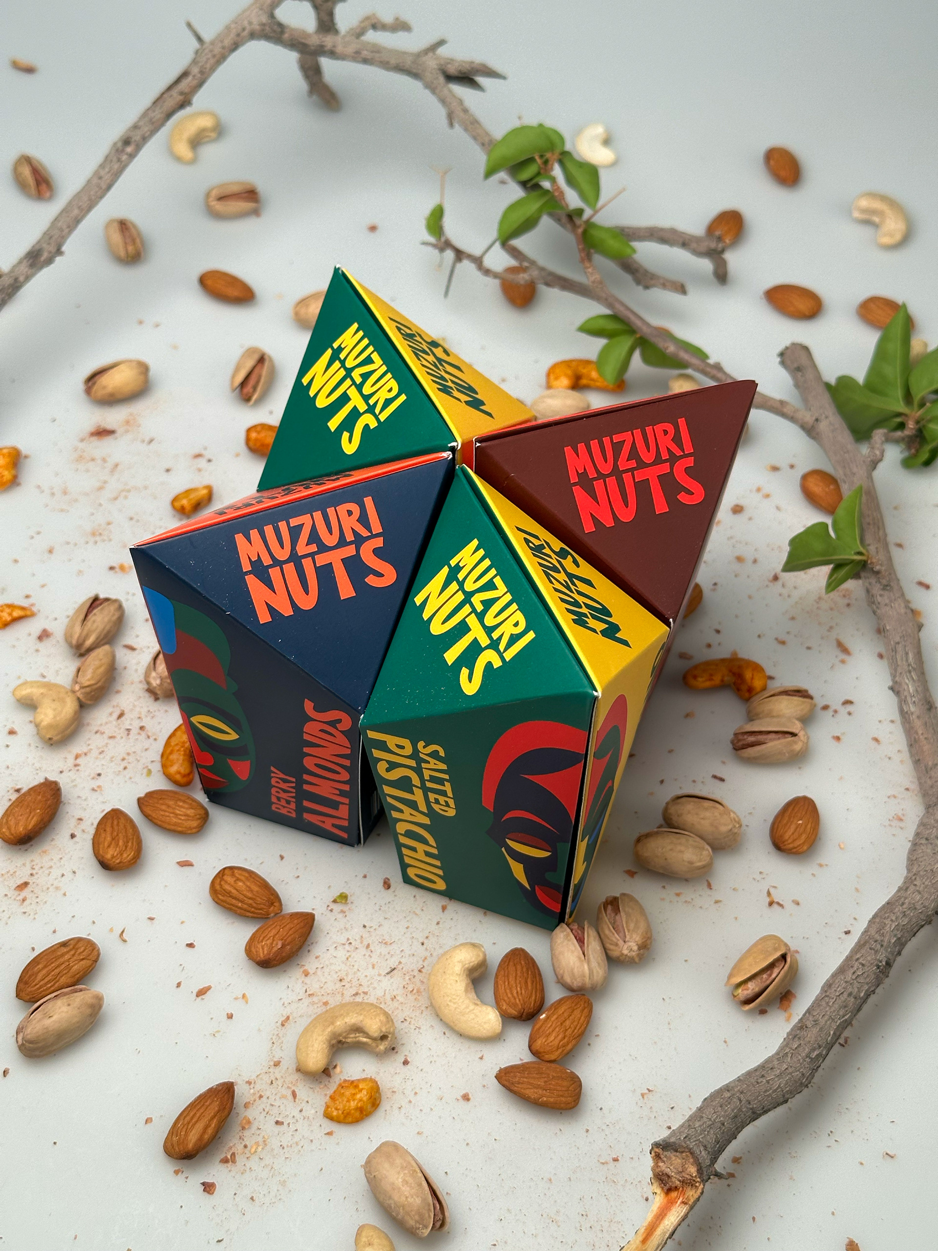
This project is a vibrant exploration of nut packaging, drawing inspiration from the rich tapestry of African patterns and colors. Rooted in cultural heritage and artistic expression, the packaging design pays homage to the continent's diverse traditions and aesthetics. The name "Mazuri Nuts," meaning "Fine Nuts" in Swahili, adds a touch of authenticity and elegance to the product. Each element of the packaging is carefully crafted to reflect the vibrancy and warmth of African culture, inviting consumers to indulge in a sensory journey that celebrates both flavor and tradition.

Aperta Theme Design Proposal for Huawei by Pakinam Mansour
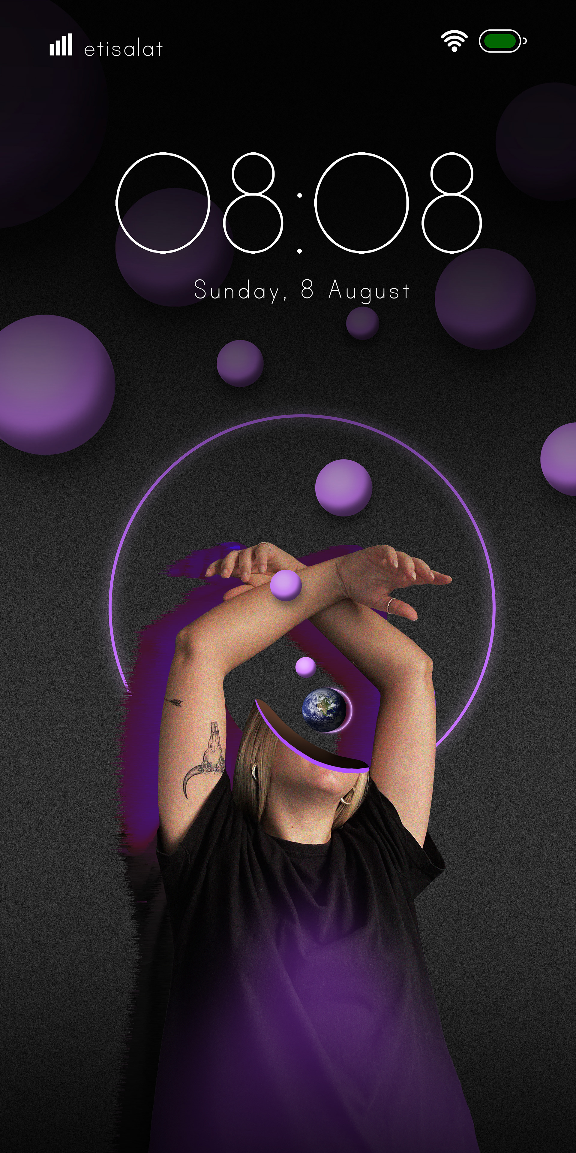
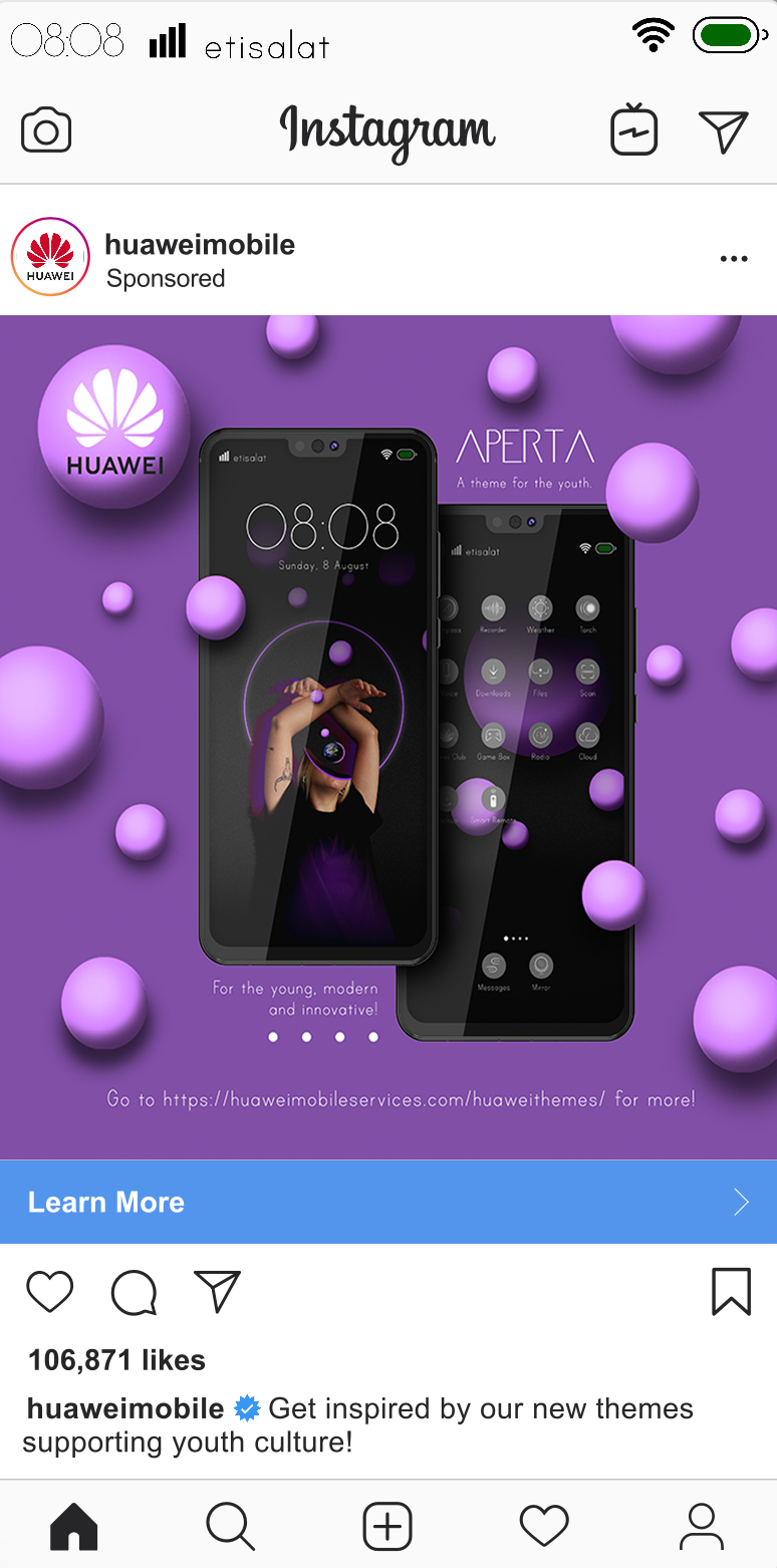
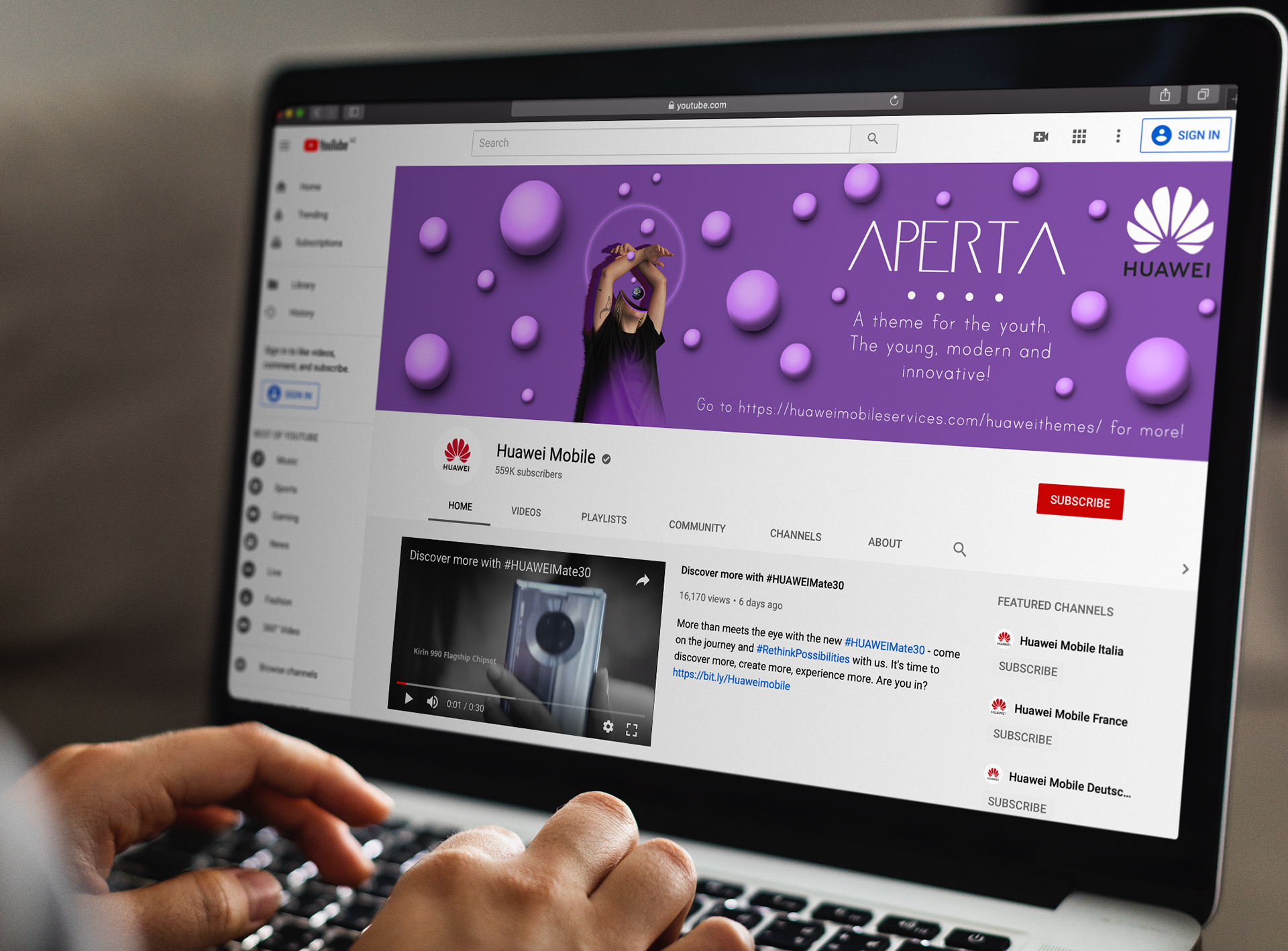
The theme design for Huawei phones is a comprehensive campaign encompassing wallpapers, sets of icons, and themes integrated across the phone's interface and social media platforms. This cohesive approach creates a seamless user experience while promoting brand identity and visual consistency. The concept behind the design, titled "Aperta," meaning "open" in Italian, symbolizes the expansion of identity and thought. It embodies a fusion of modernism and introspection, encouraging users to explore new perspectives and embrace innovative ideas. Through its visually striking elements and philosophical undertones, the "Aperta" theme reflects Huawei's commitment to pushing boundaries and fostering a culture of open-mindedness and creativity.